Volvo Trucks unveils new logo
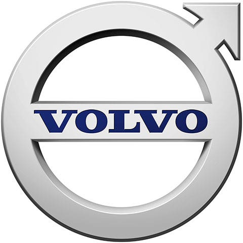
Volvo Trucks North America today introduced its new logo, a more contemporary Volvo iron mark, to North America. The new iron mark, which will be on all Volvo Trucks printed materials, web pages and dealer signage moving forward, features a more streamlined design, spotlighting the company's dedication to innovation and quality.
The iron mark maintains the familiar symbol, but is less complex than the previous version. It also features the blue Volvo word mark across the bar in the center.
"The Volvo iron mark is extremely recognizable and synonomous with quality and safety," said Magnus Koeck, Volvo Trucks vice president - marketing and brand management. "The redesigned logo enables Volvo to be more closely aligned with the iron mark featured on our products, while also differentiating us from Volvo Cars."
Seeking a strong image to represent its vehicles, Volvo began using the logo - the ancient chemical symbol for iron - in 1927. The iron mark has been redesigned through the years to reflect the ever-evolving transportation environment, while at the same time maintaining a strong link to Volvo's heritage.

Volvo Trucks North America today unveiled its redesigned logo to North America.
Download Press Release Images
